
You are here: Vanderbilt Biostatistics Wiki>Main Web>StatComp>RS>Hmisc>HmiscNew (29 Jan 2014, FrankHarrell)Edit Attach
New Functions in the R Hmisc Package
summaryM
In place ofsummary(group ~ a + b + c, method='reverse') (which calls summary.formula) use summaryM(a + b + c ~ group)
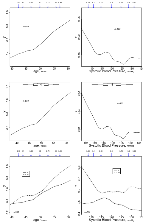
summaryRc
This is for graphinglowess nonparametric trend lines. This provides a much better summary than summary.formula method = "response" which in the example below would by default categorize age and bp into quartiles in order to get simple proportions of y.
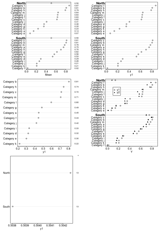
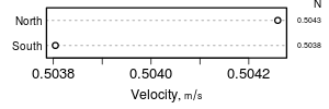
summaryD
summaryD is for summarizing data using a user-specified function and produce a dot chart using the Hmisc dotchart3 function. This allows for major and minor categories, all in one panel.
bpplotM
This is for graphing extended box plots for multiple variables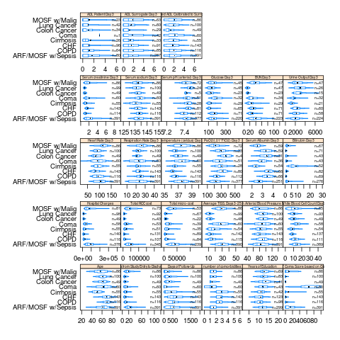
bpplotM also supports an R formula as the first argument, e.g. bpplotM(age + weight + height ~ treatment * sex)
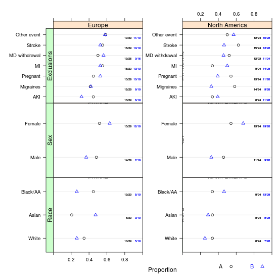
summaryP
This is likebpplotM but for purely categorical data. It produces a "tall and thin" data frame with numerator and denominator frequencies. A plot method makes multi-panel dot plots using the R trellis dotplot function with a special panel function, to depict proportions by a series of cross-classifying variables, plus optionally a superpositioning variable groups. summaryP provides special support for a series of "checklist" yes/no variables through an internal function yn. For yn, a positive respose is taken to be y, yes, present (ignoring case) or a logical TRUE.
 Also try:
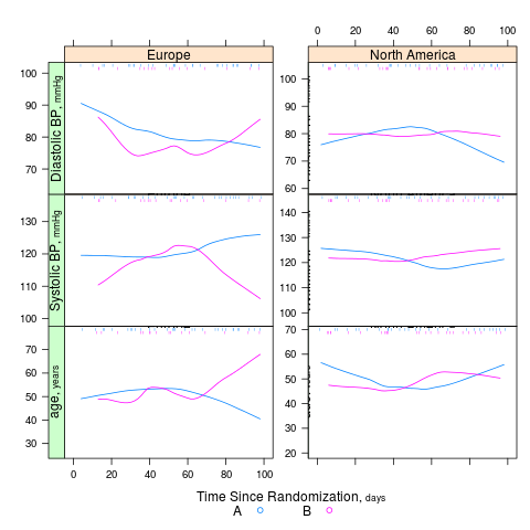
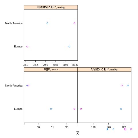
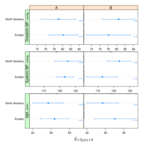
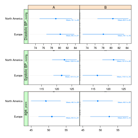
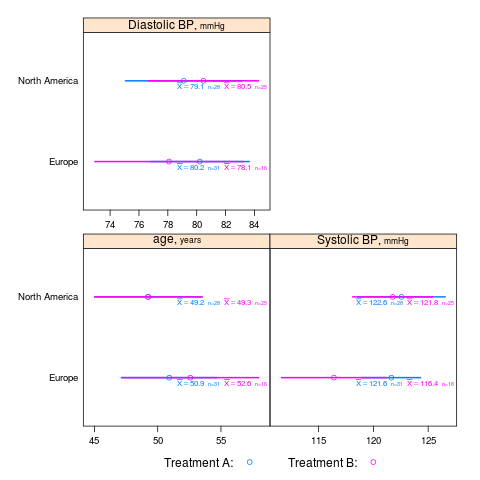
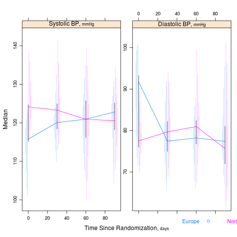
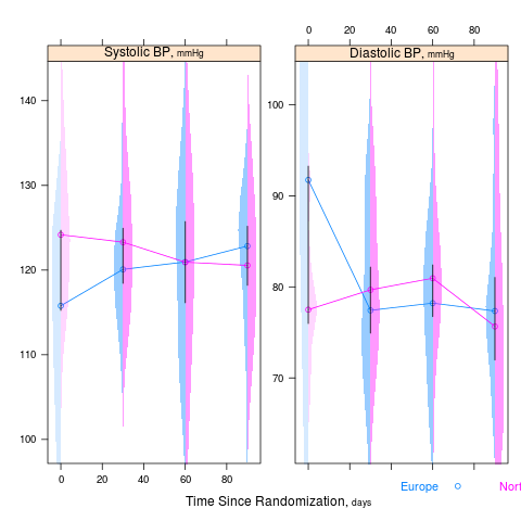
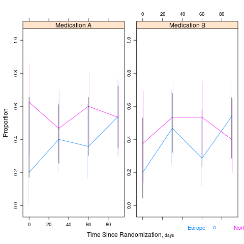
summaryS
summaryS summarizes multiple response variables and makes multipanel scatter or dot plots. An optional fun argument can specify a wide variety of summary statistics to compute.
d <- upData(d, labels=c(sbp='Systolic BP', dbp='Diastolic BP', race='Race', sex='Sex', treat='Treatment', days='Time Since Randomization', S1='Hospitalization', S2='Re-Operation', meda='Medication A', medb='Medication B'), units=c(sbp='mmHg', dbp='mmHg', age='years', days='days'))
s <- summaryS(age + sbp + dbp ~ days + region + treat, data=d) # plot(s) # 3 pages plot(s, groups='treat', datadensity=TRUE, scat1d.opts=list(lwd=.5, nhistSpike=0))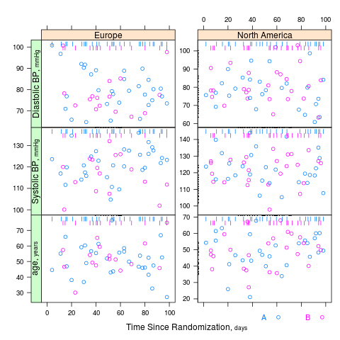


tabulr
tabulr is a front-end to the tabular function in the tables package. tabular provides an elegant syntax for advanced multi-level LaTeX and regular text tables. tabulr makes use of Hmisc package variable attributes label and units for nicely labeling table components. By default, all variables appearing in the table that have labels have those labels used (and units of measurement, if present) in place of variable names. Also provided are some utility functions to mimic summaryM output for continuous variables (see trio) and functions for creating various LaTeX macro definitions that are useful in table making. See this knitr output for an example.


| I | Attachment | Action | Size | Date | Who | Comment |
|---|---|---|---|---|---|---|
| |
bpplotM.png | manage | 89 K | 30 Jul 2013 - 15:55 | FrankHarrell | Example of the Hmisc package bpplotM function |
| |
summaryD.png | manage | 18 K | 08 Aug 2013 - 13:00 | FrankHarrell | Examples of Hmisc summaryD function |
| |
summaryD2.png | manage | 2 K | 09 Aug 2013 - 15:02 | FrankHarrell | summaryD second example |
| |
summaryP.png | manage | 32 K | 18 Dec 2013 - 15:23 | FrankHarrell | Example of the Hmisc package summaryP function |
| |
summaryRc.png | manage | 48 K | 10 Aug 2013 - 13:04 | FrankHarrell | Example of Hmisc summaryRc function |
| |
summaryS1.png | manage | 53 K | 28 Dec 2013 - 21:19 | FrankHarrell | summaryS example 1 |
| |
summaryS10.png | manage | 18 K | 04 Jan 2014 - 14:59 | FrankHarrell | summaryS example: confidence intervals for proportions and differences |
| |
summaryS2.png | manage | 35 K | 28 Dec 2013 - 21:20 | FrankHarrell | summaryS ex. 2 |
| |
summaryS3.png | manage | 56 K | 28 Dec 2013 - 21:20 | FrankHarrell | summaryS ex. 3 |
| |
summaryS4.png | manage | 30 K | 28 Dec 2013 - 21:21 | FrankHarrell | |
| |
summaryS5.png | manage | 13 K | 28 Dec 2013 - 21:21 | FrankHarrell | |
| |
summaryS6.png | manage | 20 K | 28 Dec 2013 - 21:21 | FrankHarrell | |
| |
summaryS7.png | manage | 20 K | 28 Dec 2013 - 21:22 | FrankHarrell | |
| |
summaryS8.png | manage | 17 K | 28 Dec 2013 - 21:22 | FrankHarrell | |
| |
summaryS9.png | manage | 19 K | 04 Jan 2014 - 14:58 | FrankHarrell | summaryS example: multiple quantile intervals |
| |
summaryS9v.png | manage | 18 K | 29 Jan 2014 - 16:34 | FrankHarrell | Example of summaryS: half-violin plots over time |
| |
tabulr.pdf | manage | 131 K | 17 Aug 2013 - 12:44 | FrankHarrell | knitr output demonstrating tabulr function in Hmisc |
Edit | Attach | Print version | History: r18 < r17 < r16 < r15 | Backlinks | View wiki text | Edit wiki text | More topic actions
Topic revision: r18 - 29 Jan 2014, FrankHarrell
Ideas, requests, problems regarding Vanderbilt Biostatistics Wiki? Send feedback